Z!Production

We started of with the name Z!Production and did up this design. We looked and tought that it was the best design. But then we wondered what the 'Z' stood for? I said Zulu as in the phonetic alphabet the others thought the tribe.
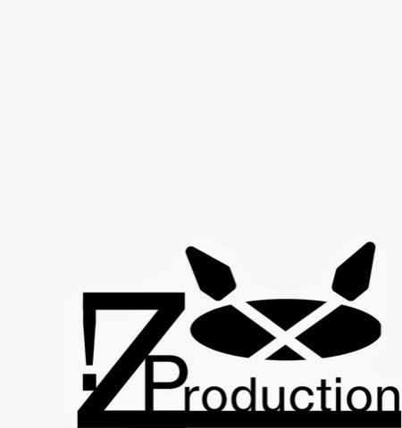
So we added the oval as the shield and in almost all the pictures we saw had crossing spears. We added the crossing spears here and we thought they looked abit big and blunt. So we new we had to change it.

We then made these spear heads and lined them up with the handles. When we all saw this one we all new it was the one we should use because it is the best and all great film company's have a logo and name why shouldn't we!
No comments:
Post a Comment